
 Image 1 of 1
08 Bookshop
Bookshop was inspired by the nostalgic feeling that comes from looking through old photographs of distant memories. We’re so fond of the soft hues, graininess, mild yellow undertones, and faded blue highlights that give Bookshop a vintage feeling.

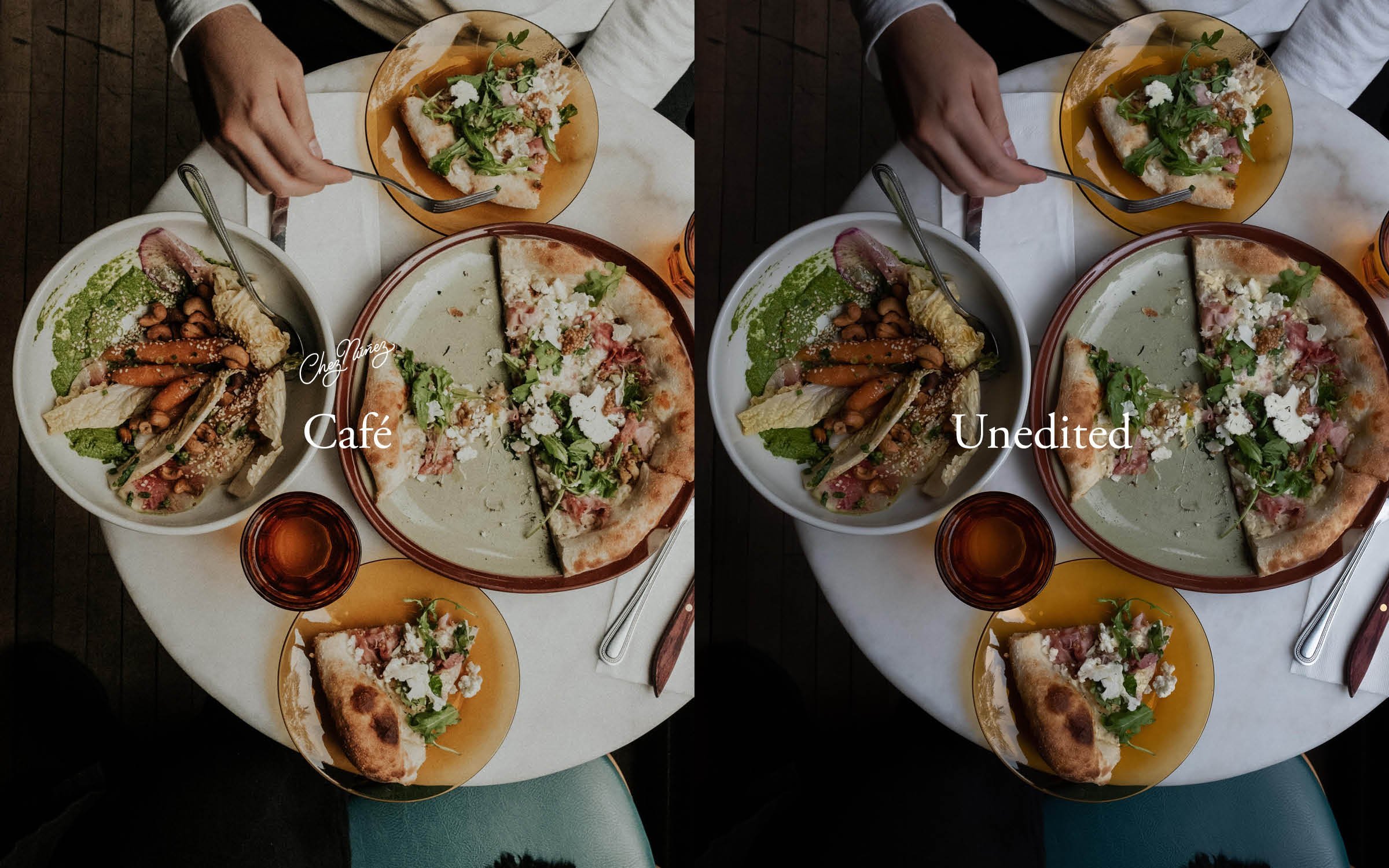
09 Café
Café is a preset that has a clean and crisp feel to it - with an emphasis on brighter highlights, a bit darker darks, and a hint of a pink hue. We love the way that Café enhances the natural colors that a photo already possesses.
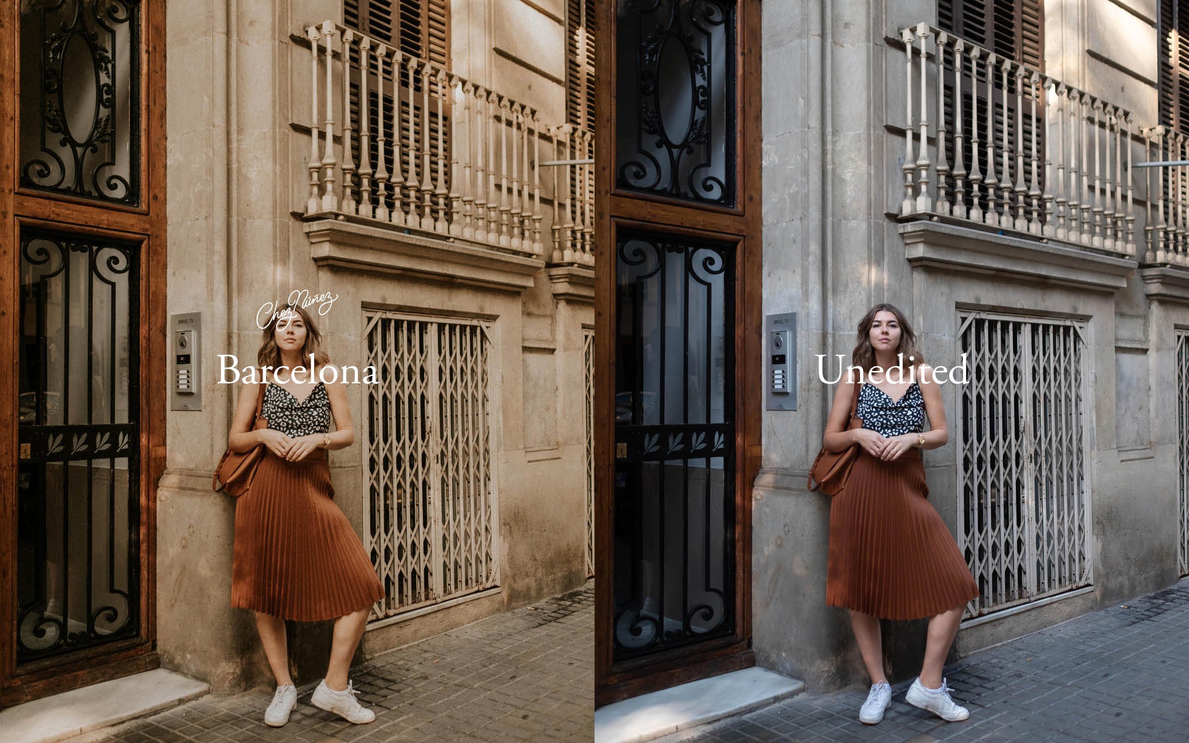
10 Barcelona
Barcelona was inspired by the warmth of our first trip to Barcelona, Spain. When we look at the way this preset enhances and softens warm images, we feel the air of this city, picture the old buildings, and think of the delicious food that we ate on that trip.
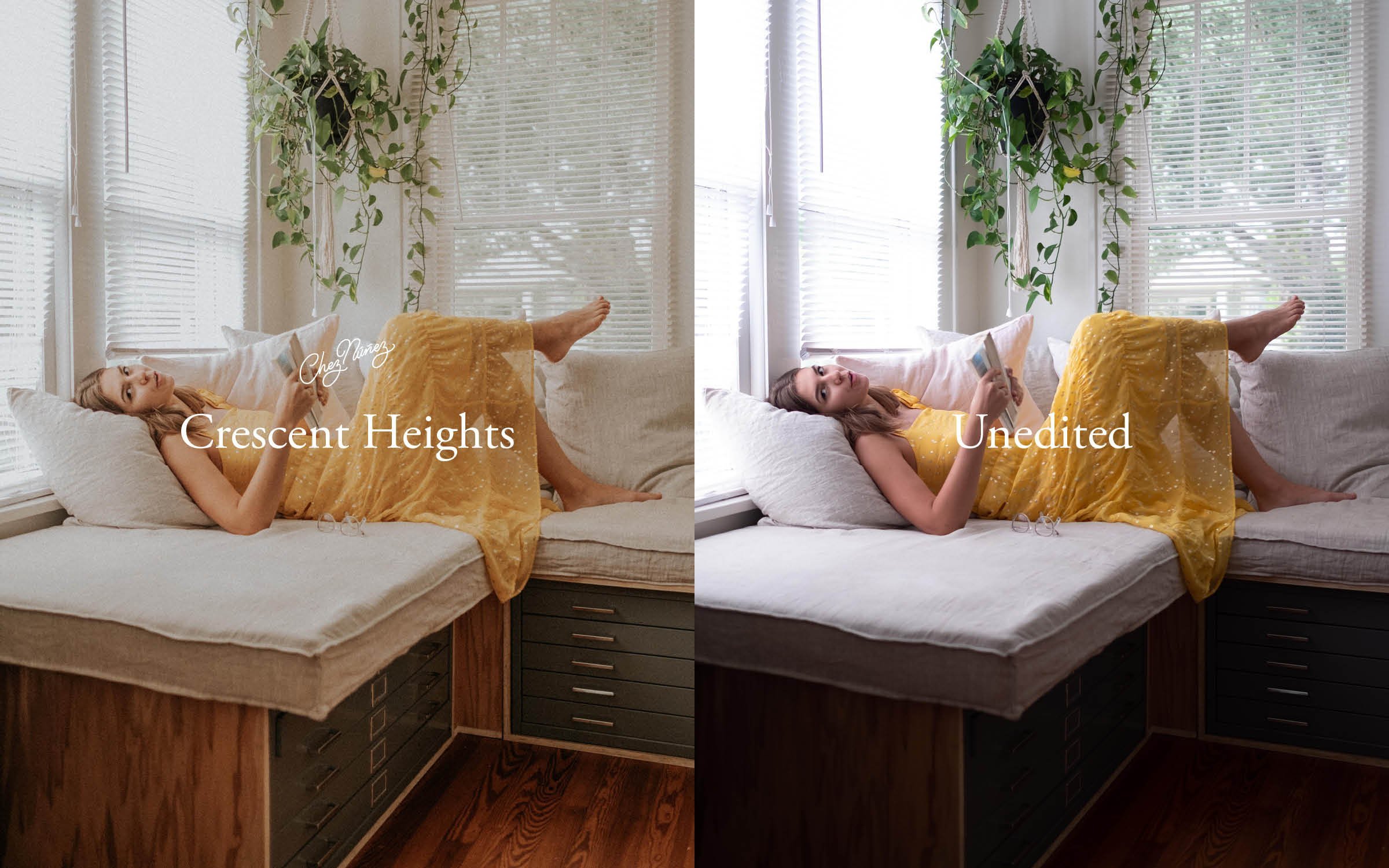
11 Crescent Heights
Crescent Heights is named after our very own neighborhood, the place where all our adventures start out. This preset is very subtle, with mild contrast, and a hint of grain. Although we love Crescent Heights on images with diffused natural light, it can be easily tweaked to work beautifully in a variety of lighting scenarios!
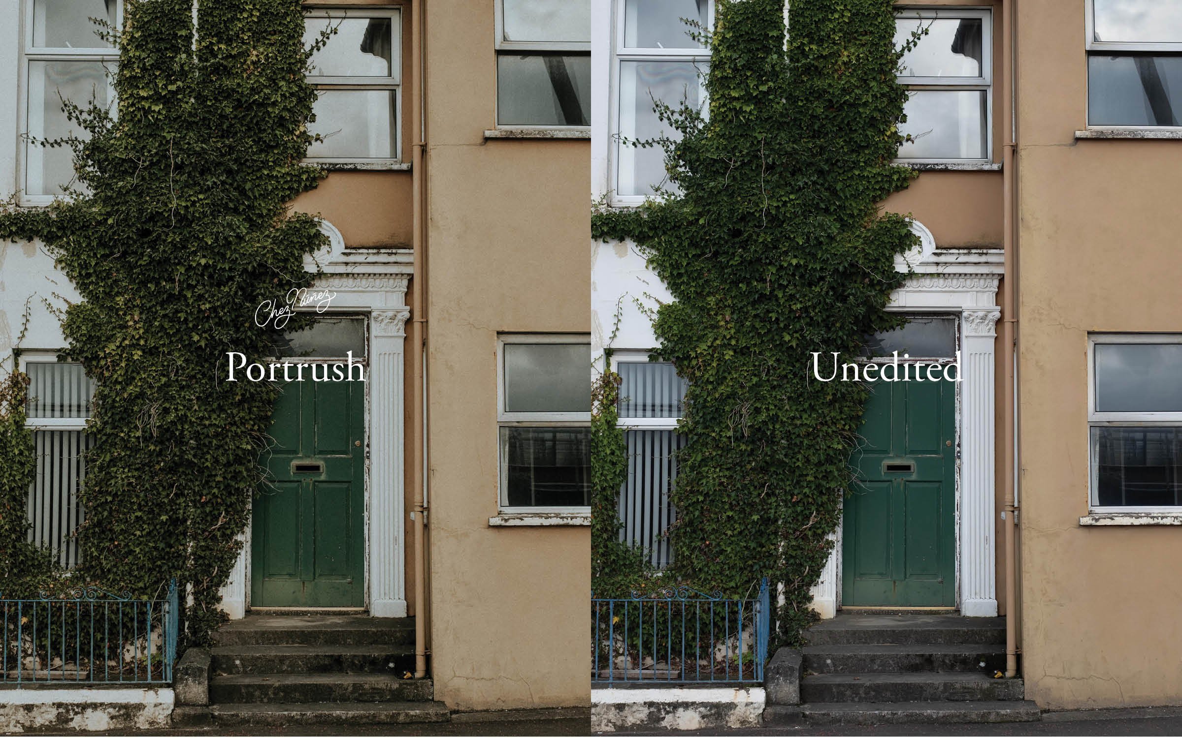
12 Portrush
Portrush is a preset with overcast vibes, and a sense of moodiness. We love how it reminds us of the rainy skies and the mossy cliffs of the small town on the coast of Northern Ireland by which it was named. There’s a subtle celebration of color and contrast that Portrush offers, with an emphasis on the true blacks of an image.
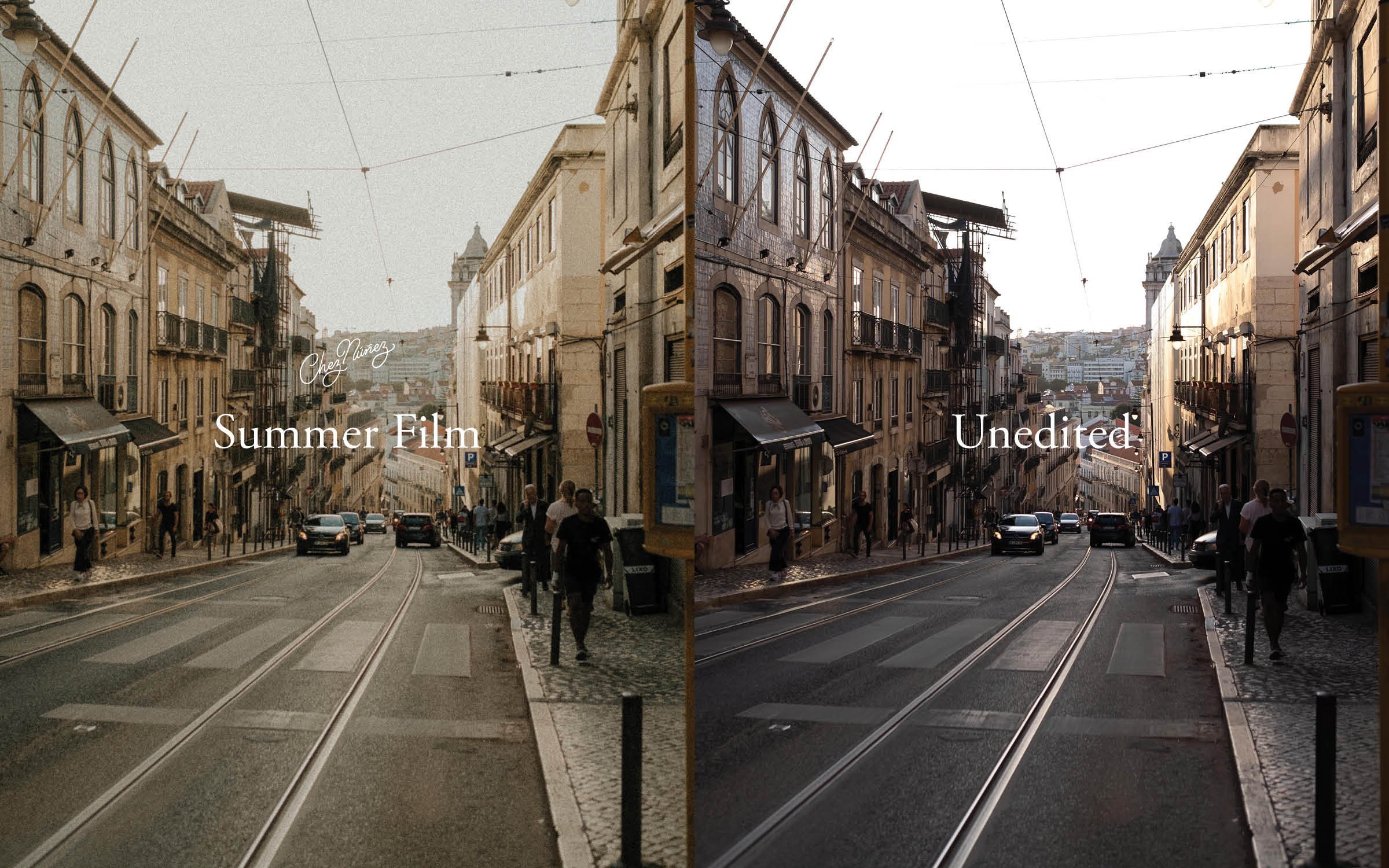
13 Summer Film
Summer Film was made to look and feel exactly as the name suggests - like that of a grainy snapshot from the best summer ever, years ago. With it’s low contrast, muted highlights, and yellow/blue tones, we love applying this preset to old vacation photos, and to the ones that are currently documenting our life at home.
14 Yellowstone
Yellowstone is our take on a preset that truly celebrates photos of the natural world. It enhancing greens and blues without overly saturating them, and there’s a crispness to it that makes Yellowstone a beautiful editing companion for any outdoor activity that you’d like to capture.

15 Lisboa
Lisboa was inspired by the warm, colorful buildings, tiles, and sunsets of Lisbon, Portugal! It’s a bright preset, that’s low in contrast, with a mild, grainy vibe overall. We really love how Lisboa celebrates the yellows and oranges in an image.

16 MoMA
MoMA is our first preset that we’ve made to intentionally tackle indoor lighting! Although it was initially inspired by the loads of photos that we’ve taken in museums (+ our desire to edit them in a way that stayed true to the color of the artwork without creating wonky skin tones, or veering off brand), MoMA has evolved to help us edit in a variety of other settings as well. Images on subways/metros, inside shops, or photos taken at home under artificial light can really shine with MoMA!
